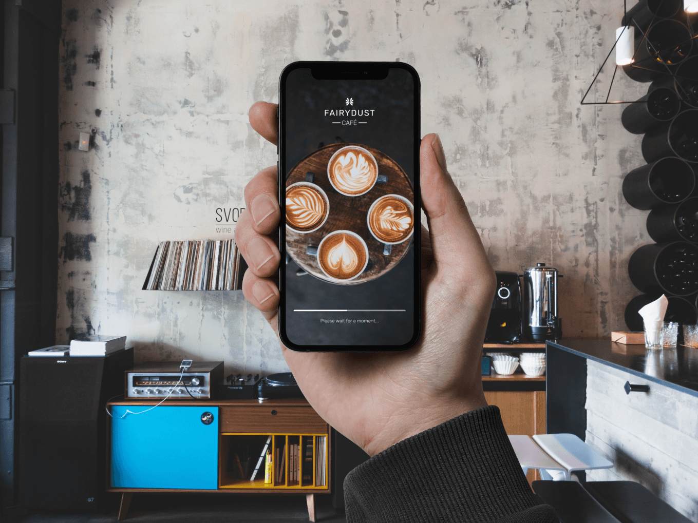
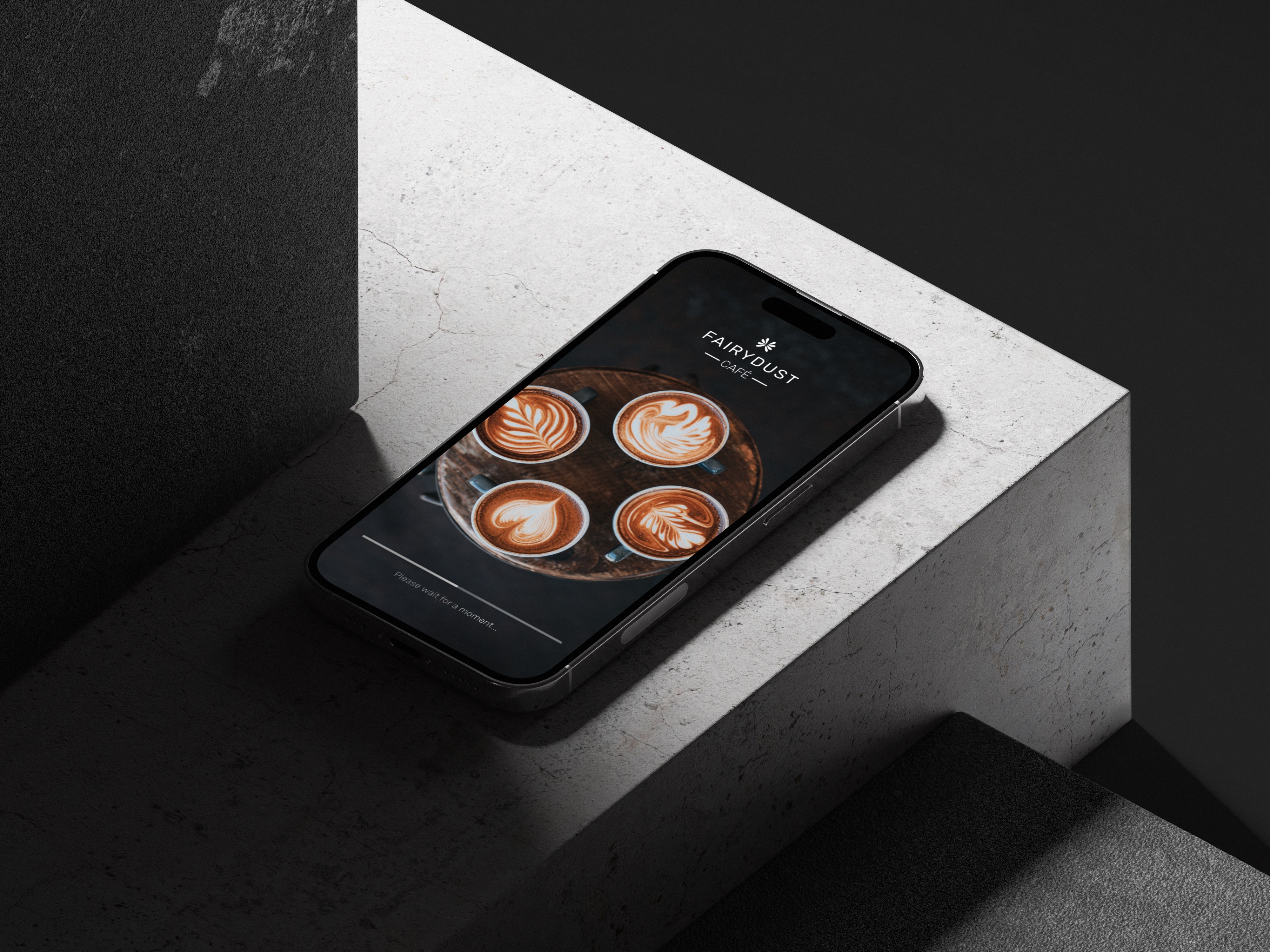
FAIRYDUST CAFE
FAIRYDUST CAFE
FAIRYDUST CAFE
Description
A startup cafe that wants to have a mobile app that aims to provide a seamless online delivery service, designed for customer convenience.
Description
A startup cafe that wants to have a mobile app that aims to provide a seamless online delivery service, designed for customer convenience.
Description
A startup cafe that wants to have a mobile app that aims to provide a seamless online delivery service, designed for customer convenience.
Client
Fairydust Cafe
Year
2023
Type
Mobile App Design
Client
Fairydust Cafe
Year
2023
Type
Mobile App Design
Client
Fairydust Cafe
Year
2023
Type
Mobile App Design
GOAL
The goal of this mobile app design is to create an intuitive and user-friendly platform that enhances the overall customer experience, offering seamless access to Fairydust Cafe's menu and ensuring efficient online ordering for their patrons.
GOAL
The goal of this mobile app design is to create an intuitive and user-friendly platform that enhances the overall customer experience, offering seamless access to Fairydust Cafe's menu and ensuring efficient online ordering for their patrons.
GOAL
The goal of this mobile app design is to create an intuitive and user-friendly platform that enhances the overall customer experience, offering seamless access to Fairydust Cafe's menu and ensuring efficient online ordering for their patrons.
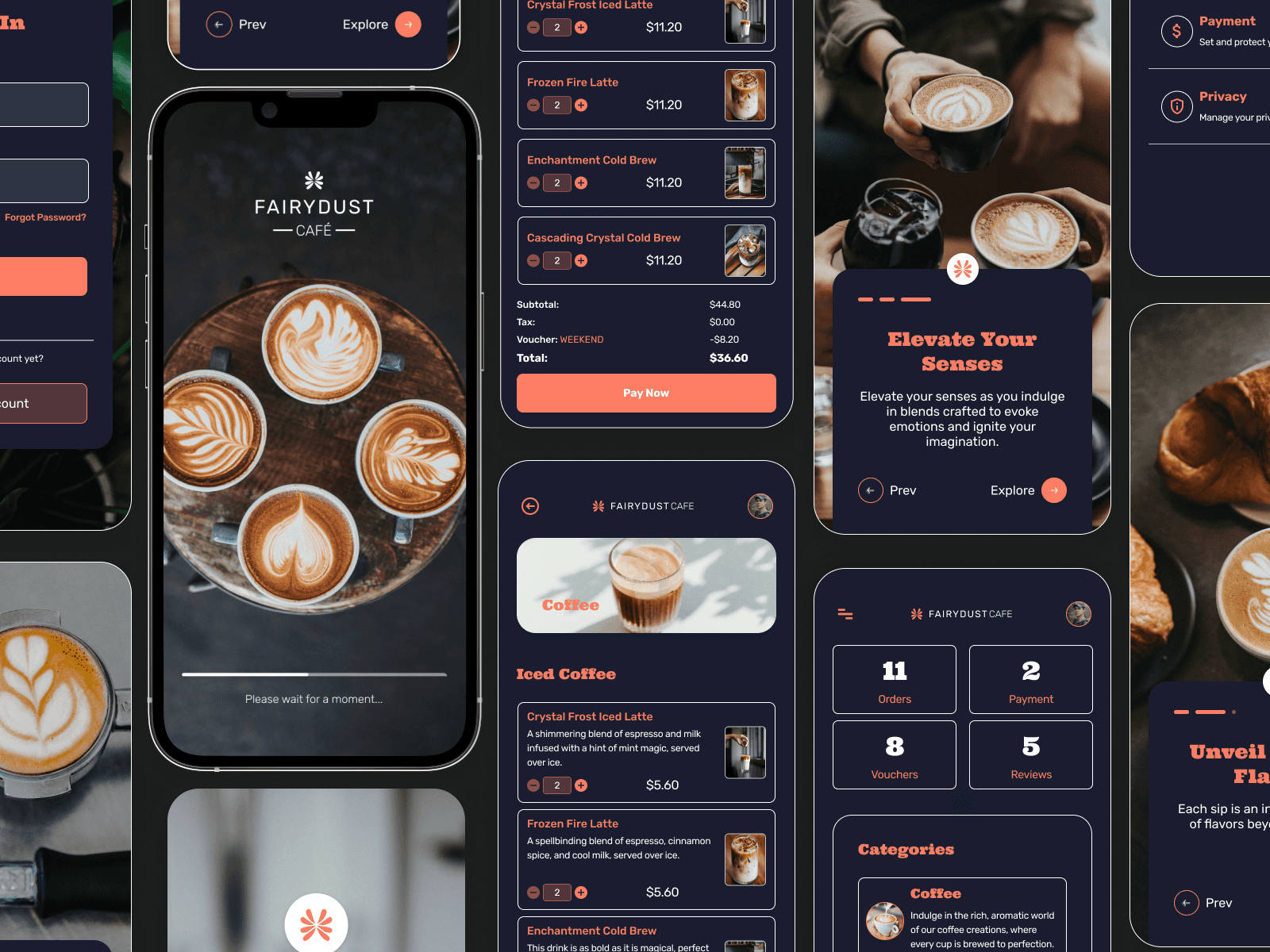
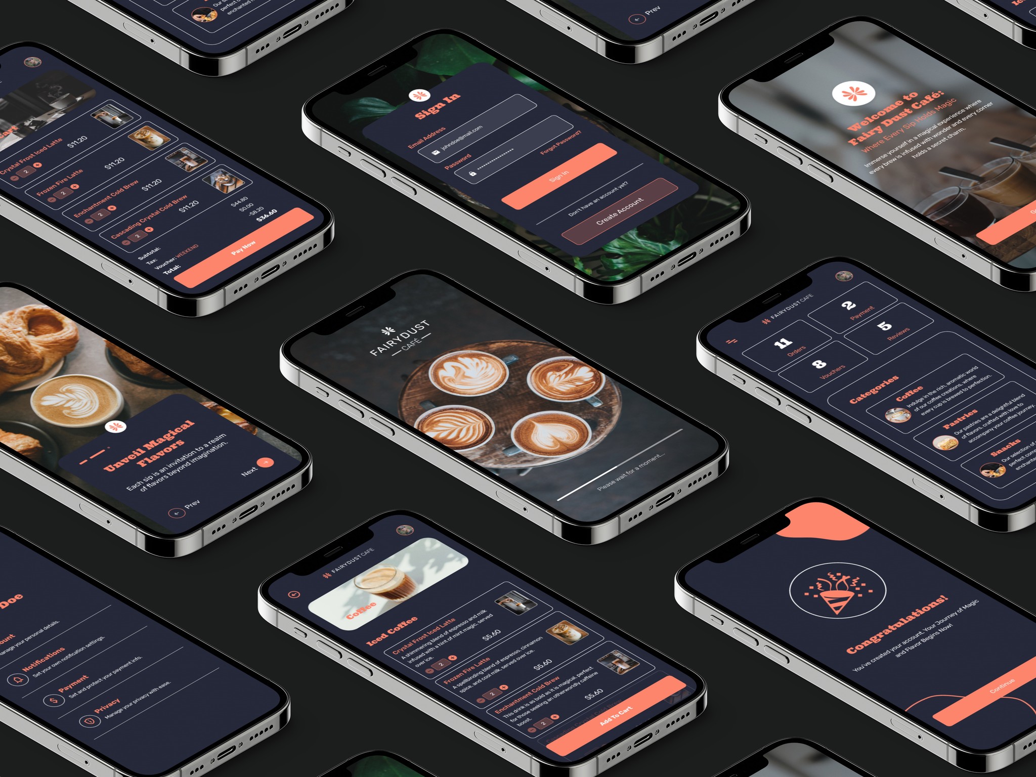
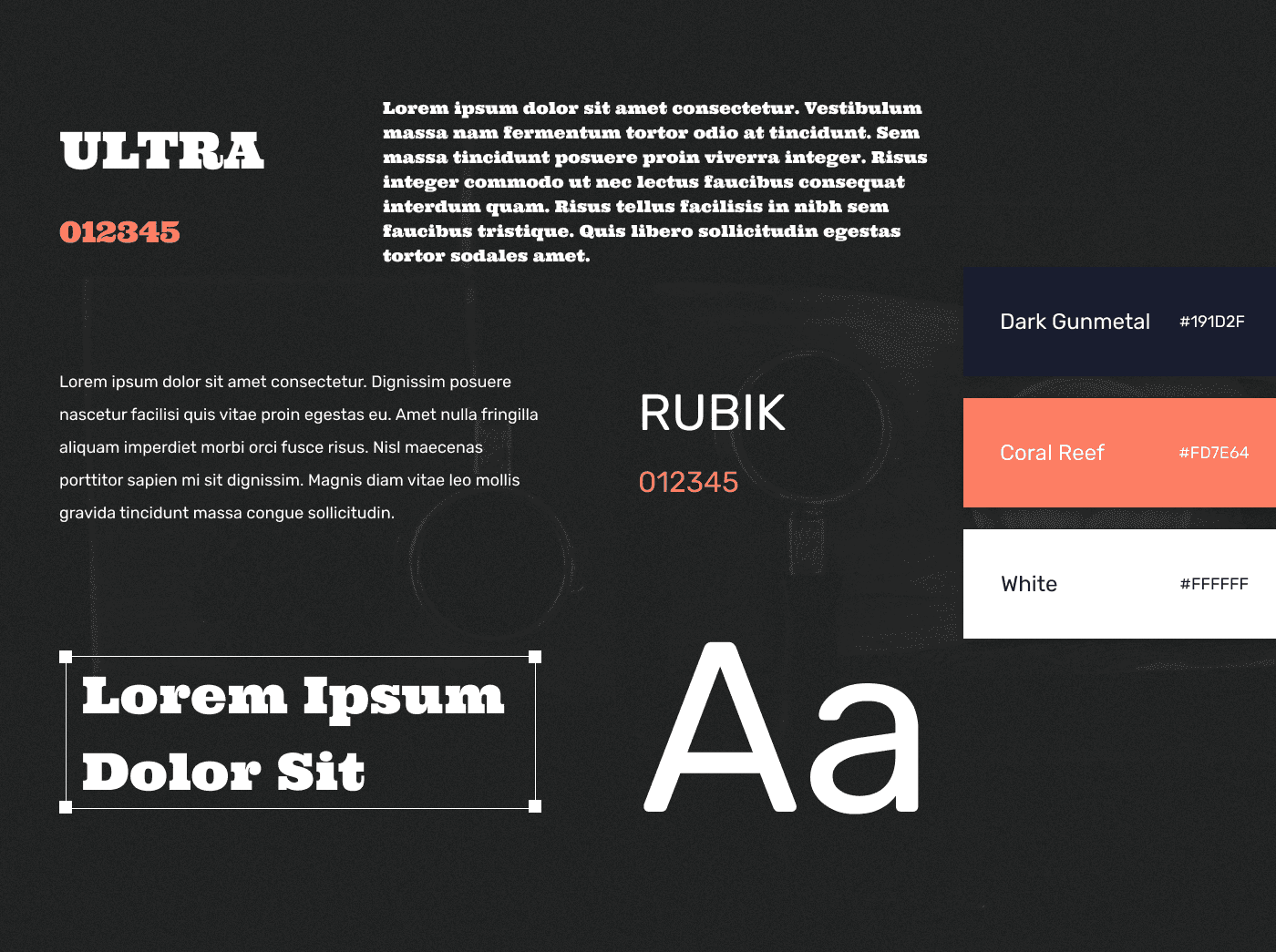
COLORS & TYPOGRAPHY
The app predominantly features a dark blue color, conveying a sense of professionalism and calmness. Complementing this is the use of orange, injecting energy and vibrancy into the design. For typography, employing bold serif fonts for headings to convey a sense of emphasis and professionalism. Sans-serif fonts are for subheadings and descriptions, ensuring a clean and modern look that enhances readability and user experience.